Private Jet Ride Sharing
Like Uber but for Planes
Like Uber but for Planes
A service that allows people to share the cost of rides on private jets as well as explore the destinations that they or others are travelling.
Audit of booking process and site architecture.

Aligning the specific flows for users across the various service offerings for sharing and joining existing flights.

Finding ways to streamline the sign-up process and leverage social media data.
The inception of this platform began with a very simple premise which needed to be further explored and defined. There are two distinct types of flights: ones which can be shared and ones which are private. For both there needed to be specific ways in which users could request flights and modify specific details within the application.
The overall goal of designing the platform was to take a very complex set of processes and break them into very simple tasks. There needed to be a lot of flexibility in the design to accomodate the various value propositions of the platform. Though the clientele of this service would be a select (and fortunate) few, the core aspects of the product needed to be usable for techno-enthusiasts as well as those lacking computer skills.

The dashboard had to be feature rich yet focus on specific objectives of the user such as knowing where they were going to next and seeing up-to-date notifications of changes in their flights.

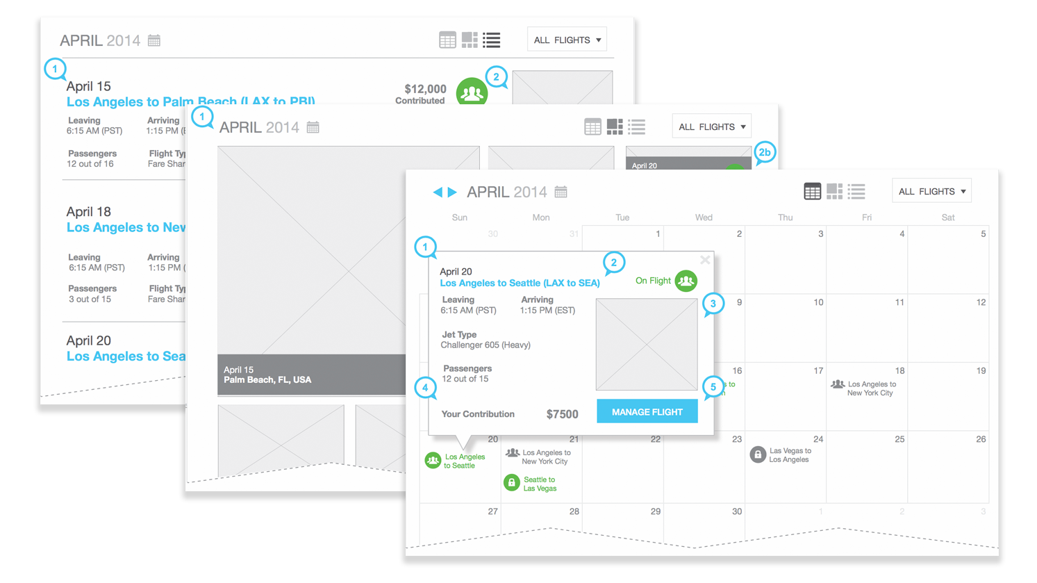
Since users of the platform could jump on other user's flights, they needed to see a calendar view of when shared flights would be offered as well as their own scheduled flights. Details needed to be quickly seen at a glance.

A unique view that blends the calendar and list view of flights to give users a mosaic view of possible destinations. This highlights the lifestyle aspect of the service and leads in to additional offerings the company wanted to make available at specific destinations.

Processes for requesting and changing flights are broken down into a few simple steps instead of one page with numerous options. Selecting specific options allows the user to change their path without having to navigate them away from the screen.

When on a flight, details are shown alongside the social engagement within the application to highlight the unique value proposition of the shared private jet flight.
Even though the specific process behind this service is very complex and requires numerous checks and balances, the user is only aware of the simplicity of the interface in front of them. This key to this UX design was to make even the most complex of tasks seem very manageable. There was careful attention paid to providing different options for viewing flights to allow users to more easily discover shared flights.
Since the development team was likely to adopt some of the styling queues from these lo-fidelity wireframes, I made sure to capture specific interactions that different aspects of the interface would offer. Whether this was specific ways a slider would operate or more complex hover states in the calendar view, I made sure to highlight these aspects of the design.
Unfortunately this service is still under construction and the actual fruits of my labor cannot be immediately seen. This did however open the door for numerous other projects with the design agency that contracted me for the work. I was able to impress them with my ability to go above and beyond the basic requirements and to envision a solution which was not only satisfactory, but produced a delightful user experience.